Paint Colors for 2020 Inspired by Health, Wellness and Restoration
Two big paint color announcements were made at NeoCon 2019 in Chicago, the biggest interior design conference of the year. As a facility manager or owner, NeoCon provides valuable product insights and solutions for your building and occupants as well.
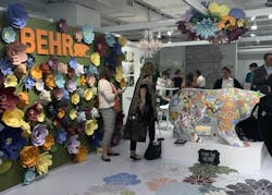
For example, the paint palettes for 2020 from Behr Paint and PPG were showcased on the showroom floor and continue the upward trajectory of wellness in the workplace. Both brands draw on health for inspiring the colors selected.
Behr Paint 2020 Color Trends Based on Research
Behr Paint unveiled its 2020 Color Trends palette: “a balanced mix of grounding shades, energizing bright color, deep accent hues and atmospheric pastels,” according to a press release.
The new palette comprises 15 colors in three categories—Worldhood, Restore and Atmospheric—and was curated based on a global color trend research to inspire designers as they select color schemes for projects in the year ahead.
[Inspired, but need paint supplies? Start here.]
1. Worldhood
Colors in this category are ideal for the hospitality industry, as they offer depth and brightness and deepen the warmth of a space.
In a press release, Erika Woelfel, vice president of color and creative services at Behr Paint, says retail and hospitality environments are also ideal. “[People] will feel drawn to the rustic tones inspired by exotic travels that reflect natural rugged landscapes,” she says.
[More from NeoCon: Look and Feel of Real Wood with the Benefits of Laminate]
Worldhood Color Palette:
2. Restore
The theme of this category is serenity. Colors aim to provide restorative qualities and balance. Specifically, blues and greens celebrate the outdoor environment.
“Blues and greens create a soothing sanctuary, which is why we recommend them for healthcare and hospitality environments,” Woelfel says.
Restore Color Palette:
[Related: Tips for Indoor Painting Projects in Occupied Buildings]
3. Atmospheric
These colors comprise subtle pastels and neutrals. Woelfel says it’s apt for both modern and traditional environments, making it an ideal choice for commercial spaces.
Atmospheric Color Palette:
“Each color in the 2020 Color Trends palette evokes an organic beauty that resonates with both modern and traditional commercial environments, from renovated industrial office spaces to hospitality venues,” Woelfel says.
The palette takes inspiration from “the desire to engage with the world around us and restore balance in our everyday lives,” as well as commercial designers creating spaces that are more connected to health and wellness.
PPG’s 2020 Color of the Year Promotes Calmness
“The faster technology moves and the more convenience it offers, the more we seek activities, experiences and lifestyles that impart slowness and realness into our lives,” says Dee Schlotter, senior color manager for PPG, in a press release.
[On topic: Healthy Materials Lab Guide to Safer Paint Options]
“The need for simplicity and escapism from technology is, in part, the reason that consumers are craving blues like Chinese Porcelain that bring us closer to natural elements such as the sea and sky—creating serenity in any space.”
Schlotter added that consumers are tiring of grays and looking to infuse color that delight the senses. “Blue is the easiest possible entry point from the world of neutrals to the world of color,” she explains. She recommends pairing Chinese Porcelain with décor such as lush drapes, velvet pillows, leather accents and dusty sand tones.
Two handpicked articles to read next:
About the Author

Sarah Kloepple
Associate Editor
Sarah joined the BUILDINGS team as an associate editor in August 2018. She is a graduate of the Missouri School of Journalism, where her focus was magazine writing. She's written and edited for numerous publications in her hometown of St. Louis.
