5 Tips on How to Use Graham and Brown’s Color of the Year: Epoch
Launching the 2021 collection from its design headquarters in Blackburn, England, through a digital showcase, wallpaper and paint specialist Graham & Brown recently presented its annual Wallpaper of the Year: Timepiece; and Color of the Year: Epoch.
Drawing upon 75 years of design and manufacturing experience in the field, the in-house design studio identifies key movements in the interiors sector and forecasts the future trends that will shape the Graham & Brown collections for the coming months. (All images courtesy of Graham & Brown)
Timepiece marks the start of the 75th Anniversary celebrations of the brand, which will run throughout 2021. Piecing together fragments from the Graham & Brown archive, Timepiece is an amalgamation of prints dating from 1946 to the present day. The result is a bold, innovative wallpaper that represents the essence of the Graham & Brown design philosophy, according to a press release.
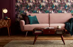
To complement the Timepiece wallpaper design, the Color of the Year for 2021, Epoch, is a directional shade of plum, pinpointing the richest purple tone in the Timepiece wallpaper and amplifying it. A calming, cocooning tone, Epoch echoes a wider interior trend which looks to create restful spaces for healthier, happier homes.
Epoch is a proud, regal and luxurious tone, as described by Graham & Brown in its press release. For those that prefer a bold style, it can shape dramatic, high-impact interiors, but the shade can also be pared back for those that favor more subdued, soothing schemes.
Abby Hesketh, product manager and paint and color specialist at Graham & Brown, shares her five expert tips for styling Epoch within a residential or commercial space.
2. If drama is your goal, Hesketh suggests pairing Epoch with other equally vivid colors.
“Partnering Epoch with shades of teal will result in an opulent, peacock-inspired look, while adding pops of peach can shape a playful yet sophisticated space,” she adds.
3. Hesketh says that color-blocking is another creative way to incorporate Epoch into a space.
“Here, you’ll see a simple geometric design using just three Graham & Brown paints—Epoch, Spiced Mulberry and Baby Powder; the result is a light and airy feature that would make a fun addition to a kid’s bedroom, playroom or even a lounge.”
5. Finally, consider creating a drop ceiling effect by using Epoch on the ceiling and then continuing the color down to picture rail height.
“This is one of my favorite interiors trends and will work well with any of the perfectly partnered Graham & Brown paint shades,” Hesketh says.
Need to catch up on more 2021 color of the year stories? Read more here:
About the Author

Adrian Schley
Staff Writer
Adrian Schley has been writing for interiors+sources magazine since March of 2018 and creates content for the BUILDINGS team. She earned her BA in journalism at the University of Iowa, where she also studied English.


